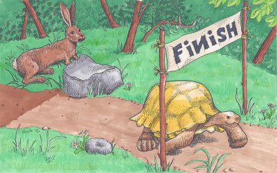
My version of a classic story. 1 Cor 9:24 - Run to win! I googled "tortoise" and "hare" to get some reference photos, but I ended up making them up to get them in the positions I wanted. I was trying to have the hare look like he just woke up, does that come across?
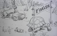
 I am happy with the way the tortoise is stepping out into the sunshine to cross the finish line, while the hare wakes up, aghast, in the shadows. I'll try to replace the photo with a scan tomorrow - the quality isn't what I wanted. Here is the line only version too - I almost like it just as much as the color!
Drawn with Micron black pen, Prismacolor markers, and colored pencils.
*SORRY IF I DELETED YOUR COMMENTS WHEN I WAS TRYING TO FIX THE COLOR VERSION!*


12 comments:
this is wonderful Paula! I love both the line drawing and the colour version! a great illustration!
One of my favorite fables! Really nicely done. Both verisons look wonderful. Though, with the different hues and shades, there's more constrast and more POP! in the colored image.
the coloured version looks great! nice job. thanks also for your comments on my blog :-)
Nice work. Do more.
good art work Paula.
one thing....Is the "N" supposed to be backwards??
Hi, I think this is my first time commenting here, but have been peaking for a while.
Love the theme and your style, and I agree with you that the line drawing is as appealing as the color version. I participated in an ATC swap that was fairy tale/fable themed and the Tortoise and the Hare was my fable!!!! Again love your style.
Turned out great!
What a great scene, and a great choice for the topic! Well done.
nice work! i like it! love the colors.
I think this came out nicely, MommaP! Yes, the rabbit definitely looks surprised and like he's waking up from a nap. Turtle's got a little smile on his face clearly knowing he's won. Like the little details you added in the banner--the stitching and the backward 'N'. I can tell you had fun!
awww, it DID turn out wonderfully!!! what a great illustrator you are!
WOW...you do great illustrations but this one just hits the right spot. (A friend and I are trying to organize long term and this is our "theme" - slow and steady wins the race.)
Do you publish these somewhere for sale?
Kathy
Post a Comment